

About the Project
Every "kitchen app" has eye-catching pictures of food, recipes, ingredients and shopping lists - such as Yumly and SideCheft - but our challenge was to design an app that added value by saving time and helping the user with a step by step guide, tips and a voice assistant.
Our target: People from 20-40 years old
Main features: Timers, Step By Step (cooking order efficiency) and a Voice Assistant
Goals: Save time and make cooking easy for someone who's not a chef
User Research
Interviews
Objectives
During discovery phase of the project, we conducted user interviews to assess how users started cooking in order to better understand their motivations and also the pains they have when doing that activity.
Insights
1. Different people have different motivations
2. Cooking should be simplified, the user should be thinking as little as possible about next steps or how to better manage their time
3. If the app suggests something with a push notification on key times of day (breakfast, lunch time or before they leave work), they are better prepared to go to the groceries and buy what they need to make the meal
Personas
Based on the User Interviews, Empathy Maps, and Journey Maps we set up 2 personas. We referred to them throughout the entire design process.
Each persona had information about demographics, behaviour, needs, frustrations and things they use regularly (such as gadgets and apps).
This shaped our design in a way that whenever we had to make a decision, we would look at "Mariana" or "Pedro"'s information and would try to think "what would he/she do?" to come to a conclusion.

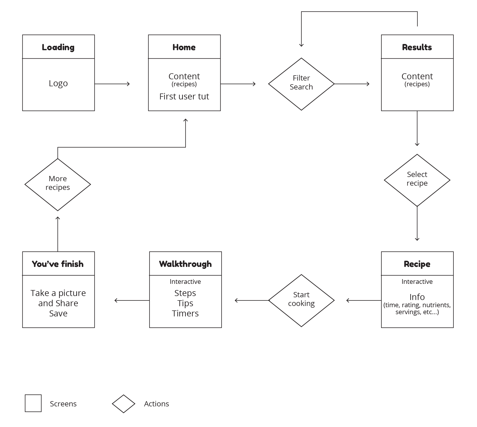
User Flow
Task
The user's task in this flow is to complete a recipe from the moment he opens the app to the moment he finishes cooking.
Context
We devised this flow so we could get a grasp on how to build our wireframe sketches.
Design
Sketches
The main purpose of our sketches was to brainstorm and try to get a sense of what's working and what isn't through outsider feedback.
We adapted our sketches each time.
Why paper sketching?
1. Need to visualize elements before designing digitally
2. Faster iterations (pencil/rubber)
3. Faster feedback

Wireframes
After paper sketching, we moved on to create wireframes for testing purposes and get an idea of how the user would interact with the app.
To adress that we also made a small Prototype with these screens.
We did 2 iterations of these wireframes and stuck with the second one.

UI Design
Once we tested out the most visible usability mistakes, we started designing the final screens in Sketch.
Visual style
1. We followed iOS guidelines to build our UI
2. We used color psychology principles and ended up choosing yellow as our main color (stimulating the user's apetite)
3. Since we know people are not holding their phones while cooking, we added a voice functionality so the user can still follow each step (voice assistant)
4. We managed to squeeze in timers and a hidden inferior menu on this screen which you can pull up with a swipe

Lessons learned
Our tendency before this project was to skip the paper sketching and going straight for hi-fi designs, although we quickly learned from experience that it's faster do iterate on paper first.
You always forget something and it's easier to "think" on paper before making big decisions.
Main problem
Time and organizing our tasks between each other.
Solution
We overcame that by doing what we were better at and then bringing it together and share feedback to maintain a consistent line of thought/design process.